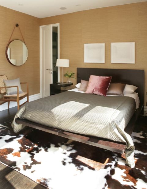
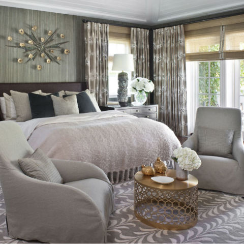
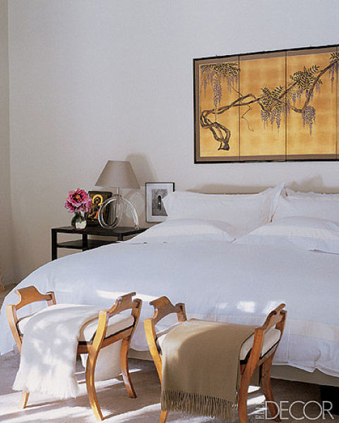
One of the most common questions we get asked is “What is the difference between an ‘Interior Designer’ and an ‘Interior Stylist’? This answer was elequently provided by Vanessa Colyer Tay for Inside Out Magazine. She said “Designers were scientists and Stylists were magicians”!
So with this in mind, here are some magical tips from our head stylist Lucy Miles.
What colours were popular in 2014 and what are your colour predictions for the year ahead?
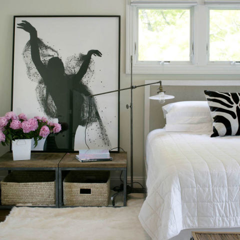
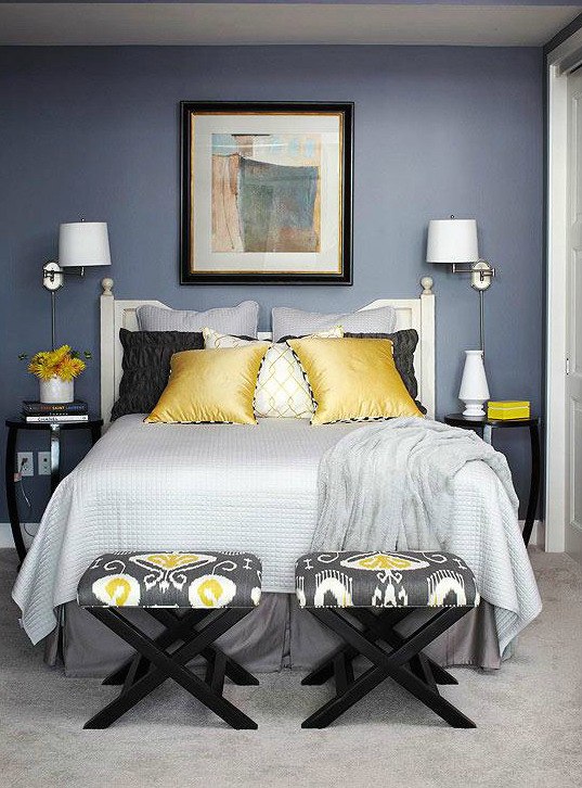
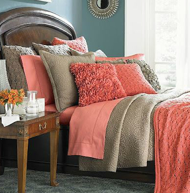
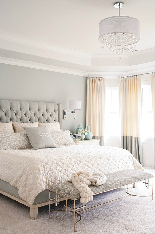
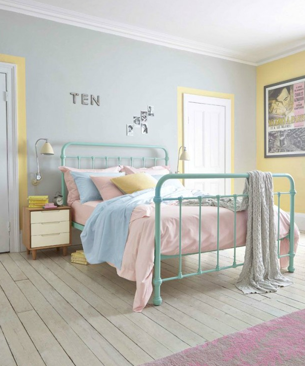
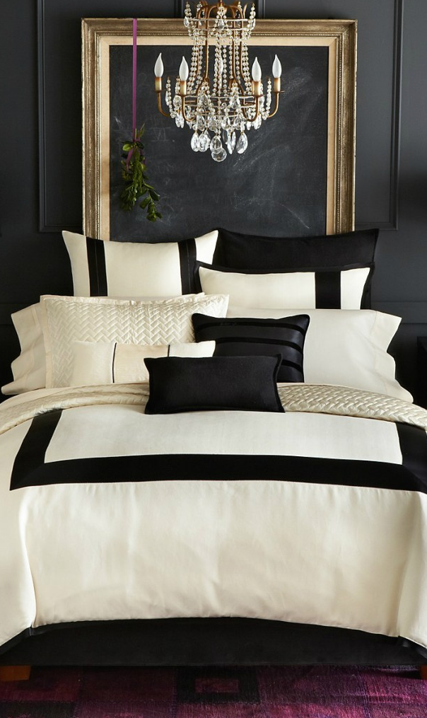
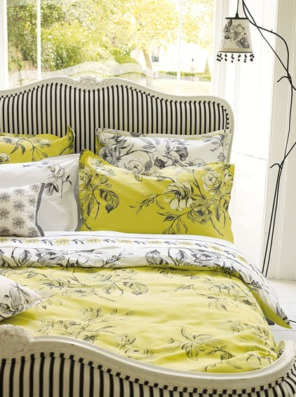
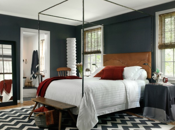
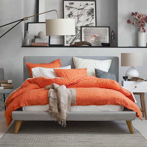
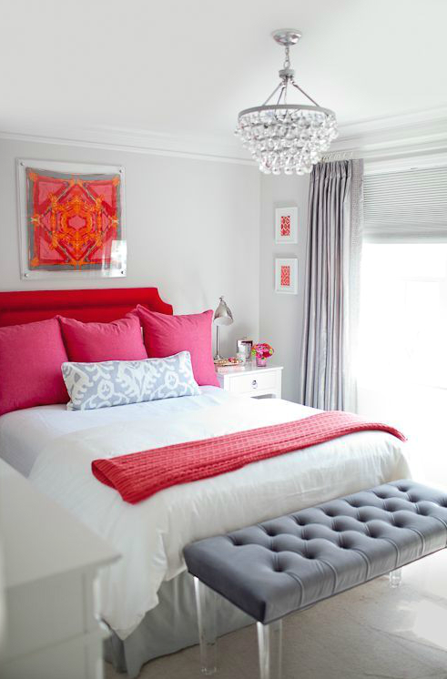
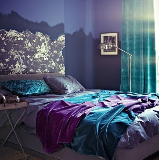
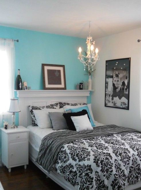
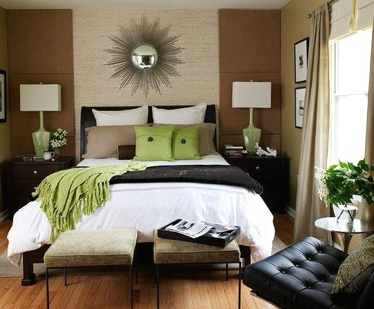
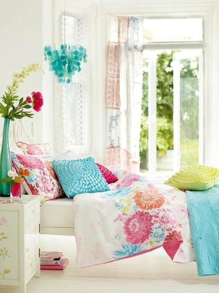
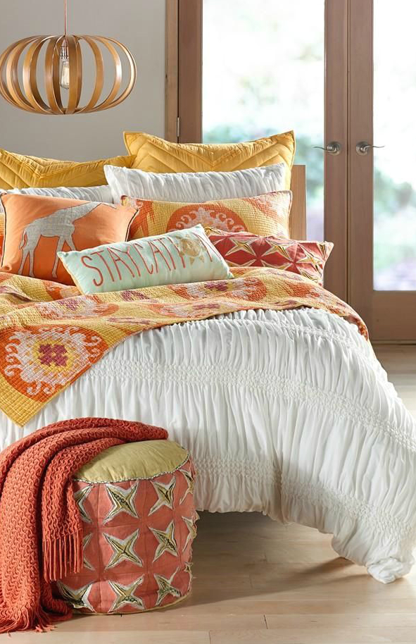
In 2014 we saw a big emphasis on blues, yellows, lime green, pinks, rose gold…. A lot of zingy colours. They are still coming through this season but with a different tone; oranges are more burnt, blues are deeper. I think everything has softened slightly… Navy is still strong. Neutrals are taking on more texture with what they are made of – it was linen, now it’s hessian. A lot more emphasis on the finishings and trimmings. Woods are still strong – maple in more mid-century style pieces; Oaks and elms with a natural finish and organic texture – they are softer than industrial or rustic.
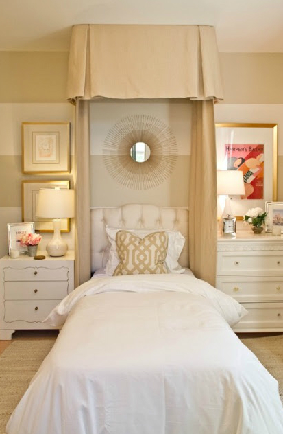
Having recently returned from an overseas buying trip, we saw next seasons ranges and colours. Pastels were very strong, with an almost ‘dusted’ effect. Khaki and soft olive greens… The flanged hem finish was a detail that continued to pop up as well.
And tartan. A lot of tartan.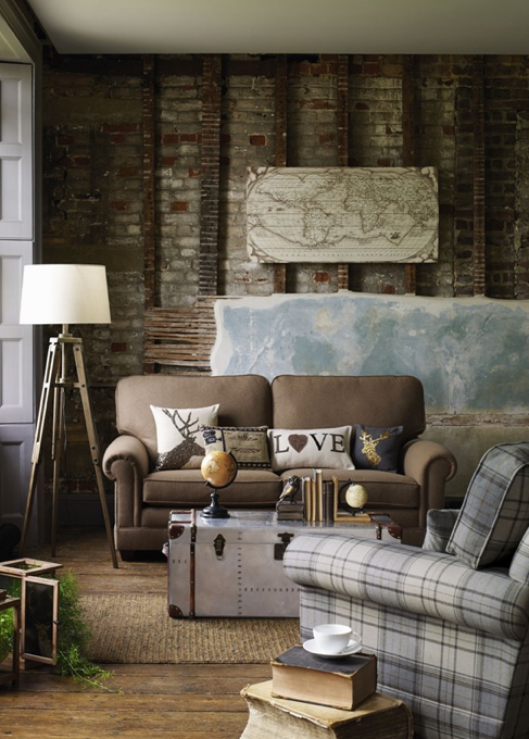
Are there any key décor trends that you think we’ll see more of in 2015?
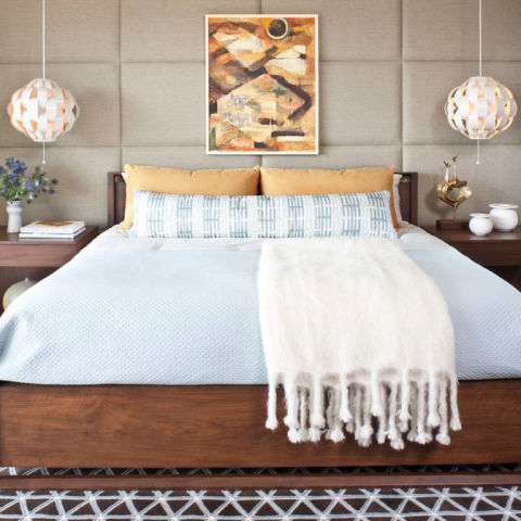
In 2015, we will continue to ride the Scandinavian train! It has been a popular trend for the last year or so in the shops and interiors and doesn’t look much like it is going anywhere. We have certainly put lot of time and effort into building up that area of our range as it is becoming a more requested look in staging – it has gone from the magazines to the homes of New Zealanders. Our customers are far more educated and aware of what trends are out there now a days. They have moved away from apartment-type furniture with mass-produced art and generic dressing – they want something a little different, special.
Replica and iconic pieces will continue too but we are moving on a bit from just the DSW chairs, Tolix stools and Barcelona chairs. There is more Wegner, Larsen, Herman, Bertolli coming through.
Matching or eclectic? What’s the secret to successfully combining non-matching furniture?
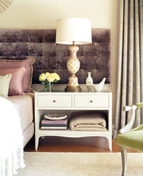
Matching on eclectic depends on what, as a Stylist, you are trying to achieve within the space. You can match or mix across different elements, from keeping the hard furniture in the same range and bringing your ‘mix’ through in the soft furnishings and accessories or going all out mixed, but keeping the palette of colour the same. Over all, the ‘matched’ look will result in a more tailored look whereas mixing your products can allow for a more ‘collected’ or bohemian feel. By mixing your product, it does allow for greater opportunities too. Regardless of whether you are going to mix or match, every story needs a thread that will tie the whole look together at the end. A blend across all products used, through the furniture, upholstery, accessories and art. In saying that, there is nothing to say you could not go with super neutral and then through in a real statement item!
Are there any interior design elements that stand the test of time?
Interior design is as varied and seasonal as fashion – they run along side of each other. Concepts continue to carry on rather than specific elements; it’s like the old blue jeans, white shirt and blazer – the style may vary somewhat from time to time however the idea stays the same. Some concepts that we build on are:
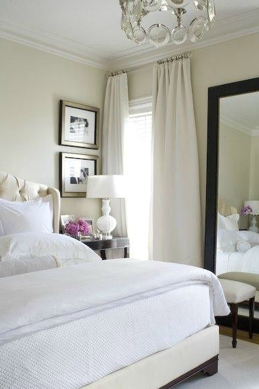
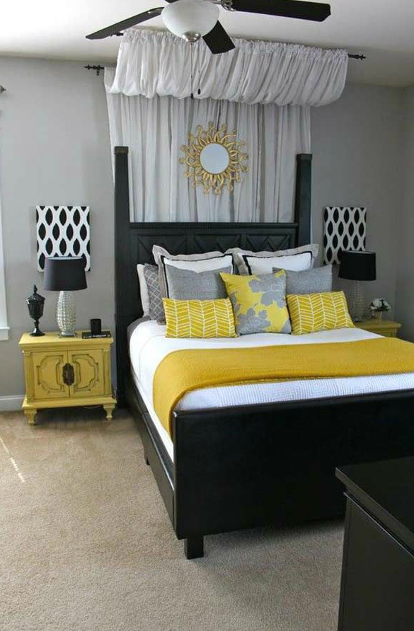
- Basic neutrals as your base
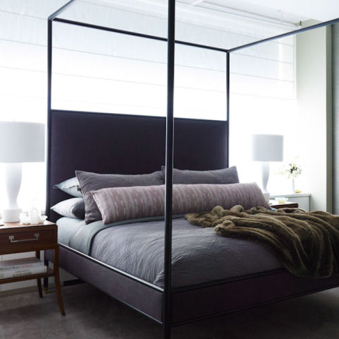
- Monochrome – black and white will always work.
- Traditional or classical style is one that is cemented through out interiors across the world, and is probably the most recognizable ‘style’ through it’s furnishings – rolled arm, deep button etc.
- Similarly iconic styles as well – Cape cod, retro, gothic…. these are very clearly defined looks.
- ‘Tricks of the trade’ continue to be used as well – mirrors for added light or space, bigger pieces in smaller spaces etc
Auckland has a variety of different housing styles – Villas, Bungalows, 60’s and 70’s houses, art deco, modern, apartments, etc. Do you approach each style differently? Are there any styles that are easier or harder to decorate?
Auckland has the luxury of having such a wide variety of property types which, for a Stylist or Home Stager, allows us to constantly hone in on our skills and ability to produce the appropriate ‘look’. Every home that we stage is approached individually. There is no ‘pre-determined’ package that is installed into a property that a vendor has brought to us to be staged. Properties are as individual as it’s owner and future-owner. We take into consideration the style of home, the owners style, the target demographic that the agent is aiming for. We are conscious that each property has it’s own set of needs and requirements. It is about doing what is best for that property.
Some times you may happen across a property that is right up your alley, which is always really fun and rewarding to dress, or a style that you have been dying to work on. On other occasions you may be completely dumb-founded at the beginning of the creative process but walk away from the completed job with such satisfaction – being creatively stretched by an ‘odd’ space can really make you feel as though you have conquered a mountain!
What’s the first thing you think about when you arrive at a home that you’re going to stage?
The leading factors to consider when walking into a property for staging are:
- What is the surrounding area like? Dressing a property in Ponsonby requires a totally different approach to dressing one in Remuera.
- What is the owner or agent like? How do they dress, or talk? What is their circumstance? You can gain great insight of how to approach the property from understanding your customer and nurturing the relationship you are building with them.
- What will be the ‘makers & breakers’? With staging, you don’t have the option of shopping specifically, or an endless supply of custom product as perhaps an independent Interior Designer might. However, we do have an exceptionally large and varied catalogue of product that has been collected over the years and continues to grow. We know our products and ranges inside-out, which helps with determining exactly what you need to achieve the desired look; I know I need the Kansas buffet or the Kelly Hoppen chair, the antique butcher block…. the key pieces. We can supply statement items that will take the staging from average to WOW!
Are there any big no-no’s when it comes to staging a house for sale?
The biggest no-no would be to completely disregard the requirements of the property in lieu of your own – we are not here to impose our own personal style. As a Stylist you need to be sympathetic to the properties personality, style, weaknesses and strengths.
If you had one decorating tip or secret that you’re willing to share, what would it be?
There are few ‘tips’ that we use on a daily basis, but none of them are particularly secret…
- Go with your gut. Nine times out of ten, your first thought is what you should run with.
- It may be cliché, but as Chanel said, take one accessory off before leaving the house! It is easy to ‘over dress’ a property. We are past the stuffy look of times gone by with flowers in every vessel, items on every surface, 12 cushions squished onto a 3 seater and 19 candles spread out in only one room. Think about what and how you are using it – place things with consideration.
- Read magazines. Get on the internet. Look at your colleagues work. Go to the interior shops in your area… What are people exposed to? What’s the current trend? Get inspiration from as many avenues as possible.
And when all else fails – call a stylist 🙂
Author: Lucy Miles Head Stylist Living Edge Interiors

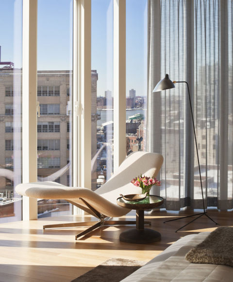


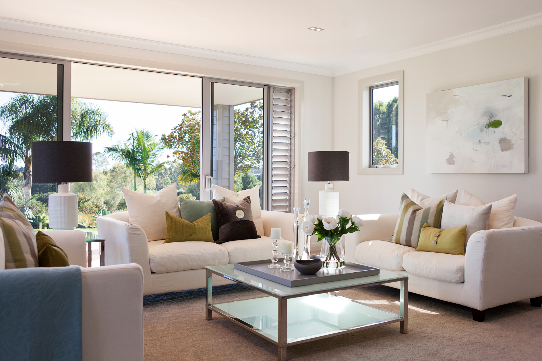
![Sunroom2[2]](http://livingedge.co.nz/~googlek9/livingedge-googlebusinessprofile-co-nz//wp-content/uploads/2014/08/Sunroom22.jpeg)